FreeType Glyph Conventions

version 2.0

Copyright 1998-1999David Turner (david@freetype.org)
Copyright 1999 The FreeType Development Team (devel@freetype.org)


Introduction

This document discusses in great details the definition of various concepts related to digital typography, as well as a few specific to the FreeType library. It also explains the ways typographic information, like glyph metrics, kerning distances, etc.. is to be managed and used. It relates to the layout and display of text strings, either in a conventional (i.e. Roman) layout, or with right-to-left or vertical ones. Some aspects like rotation and transformation are explained too.

Comments and corrections are highly welcomed, and can be sent to the FreeType developers list.


I. Basic typographic concepts

1. Font files, format and information

A font is a collection of various character images that can be used to display or print text. The images in a single font share some common properties, including look, style, serifs, etc.. Typographically speaking, one has to distinguish between a font family and its multiple font faces, which usually differ in style though come from the same template. For example, "Palatino Regular" and "Palatino Italic" are two distinct faces from the same famous family, called "Palatino" itself.

The single term font is nearly always used in ambiguous ways to refer to either a given family or given face, depending on the context. For example, most users of word-processors use "font" to describe a font family (e.g. Courier, Palatino, etc..); however most of these families are implemented through several data files depending on the file format : for TrueType, this is usually one per face (i.e. ARIAL.TFF for "Arial Regular", ARIALI.TTF for "Arial Italic", etc..). The file is also called a "font" but really contains a font face.

A digital font is thus a data file that may contain one or more font faces. For each of these, it contains character images, character metrics, as well as other kind of information important to the layout of text and the processing of specific character encodings. In some awkward formats, like Adobe Type1, a single font face is described through several files (i.e. one contains the character images, another one the character metrics). We will ignore this implementation issue in most of this document and consider digital fonts as single files, though FreeType 2.0 is able to support multiple-files fonts correctly.

As a convenience, a font file containing more than one face is called a font collection. This case is rather rare but can be seen in many asian fonts, which contain images for two or more scripts for a given language.

2. Character images and mappings :

The character images are called glyphs. A single character can have several distinct images, i.e. several glyphs, depending on script, usage or context. Several characters can also take a single glyph (good examples are roman ligatures like "oe" and "fi" which can be represented by a single glyph like "œ" and "?"). The relationships between characters and glyphs can be a very complex one but won't be detailed in this document. Moreover, some formats use more or less awkward schemes to store and access the glyphs. For the sake of clarity, we'll only retain the following notions when working with FreeType :


II. Glyph Outlines

This section describes the vectorial representation of glyph images, called outlines.
 

1. Pixels, Points and Device Resolutions :

Though it is a very common assumption when dealing with computer graphics programs, the physical dimensions of a given pixel (be it for screens or printers) are not squared. Often, the output device, be it a screen or printer exhibits varying resolutions in the horizontal and vertical directions, and this must be taken care of when rendering text.

It is thus common to define a device's characteristics through two numbers expressed in dpi (dots per inch). For example, a printer with a resolution of 300x600 dpi has 300 pixels per inch in the horizontal direction, and 600 in the vertical one. The resolution of a typical computer monitor varies with its size (a 15" and 17" monitors don't have the same pixel sizes at 640x480), and of course the graphics mode resolution.

As a consequence, the size of text is usually given in points, rather than device-specific pixels. Points are a simple physical unit, where 1 point = 1/72th of an inch, in digital typography. As an example, most roman books are printed with a body text which size is chosen between 10 and 14 points.

It is thus possible to compute the size of text in pixels from the size in points through the following computation :

pixel_size = point_size * resolution / 72

Where resolution is expressed in dpi. Note that because the horizontal and vertical resolutions may differ, a single point size usually defines different text width and height in pixels.
 

IMPORTANT NOTE:
Unlike what is often thought, the "size of text in pixels" is not directly related to the real dimensions of characters when they're displayed or printed. The relationship between these two concepts is a bit more complex and relate to some design choice made by the font designer. This is described in more details the next sub-section (see the explanations on the EM square).

2. Vectorial representation :

The source format of outlines is a collection of closed paths called contours. Each contour delimits an outer or inner region of the glyph, and can be made of either line segments or bezier arcs.

The arcs are defined through control points, and can be either second-order (these are "conic beziers") or third-order ("cubic" beziers) polynomials, depending on the font format. Hence, each point of the outline has an associated flag indicating its type (normal or control point). And scaling the points will scale the whole outline.

Each glyph's original outline points are located on a grid of indivisible units. The points are usually stored in a font file as 16-bit integer grid coordinates, with the grid origin's being at (0,0); they thus range from -16384 to 16383. (even though point coordinates can be floats in other formats such as Type 1, we'll restrict our analysis to integer ones, driven by the need for simplicity..).

IMPORTANT NOTE:
The grid is always oriented like the traditional mathematical 2D plane, i.e. the X axis from the left to the right, and the Y axis from bottom to top.

In creating the glyph outlines, a type designer uses an imaginary square called the "EM square". Typically, the EM square can be thought of as a tablet on which the character are drawn. The square's size, i.e., the number of grid units on its sides, is very important for two reasons:
 

  • it is the reference used to scale the outlines to a given text dimension. For example, a size of 12pt at 300x300 dpi corresponds to 12*300/72 = 50 pixels. This is the size the EM square would appear on the output device if it was rendered directly. In other words, scaling from grid units to pixels uses the formula:
  • pixel_size = point_size * resolution / 72
    pixel_coordinate = grid_coordinate * pixel_size / EM_size
  • the greater the EM size is, the larger resolution the designer can use when digitizing outlines. For example, in the extreme example of an EM size of 4 units, there are only 25 point positions available within the EM square which is clearly not enough. Typical TrueType fonts use an EM size of 2048 units (note: with Type 1 PostScript fonts, the EM size is fixed to 1000 grid units. However, point coordinates can be expressed in floating values).
  • Note that glyphs can freely extend beyond the EM square if the font designer wants so. The EM is used as a convenience, and is a valuable convenience from traditional typography.

    Note : Grid units are very often called "font units" or "EM units".

    NOTE:
    As said before, the pixel_size computed in  the above formula does not relate directly to the size of characters on the screen. It simply is the size of the EM square if it was to be displayed directly. Each font designer is free to place its glyphs as it pleases him within the square. This explains why the letters of the following text have not the same height, even though they're displayed at the same point size with distinct fonts :

    As one can see, the glyphs of the Courier family are smaller than those of Times New Roman, which themselves are slightly smaller than those of Arial, even though everything is displayed or printed  at a size of 16 points. This only reflect design choices.
     

    3. Hinting and Bitmap rendering

    The outline as stored in a font file is called the "master" outline, as its points coordinates are expressed in font units. Before it can be converted into a bitmap, it must be scaled to a given size/resolution. This is done through a very simple transform, but always creates undesirable artifacts, e.g. stems of different widths or heights in letters like "E" or "H".

    As a consequence, proper glyph rendering needs the scaled points to be aligned along the target device pixel grid, through an operation called "grid-fitting", and often "hinting". One of its main purpose is to ensure that important widths and heights are respected throughout the whole font (for example, it is very often desirable that the "I" and the "T" have their central vertical line of the same pixel width), as well as manage features like stems and overshoots, which can cause problems at small pixel sizes.

    There are several ways to perform grid-fitting properly, for example most scalable formats associate some control data or programs with each glyph outline. Here is an overview :
     

    explicit grid-fitting :
    The TrueType format defines a stack-based virtual machine, for which programs can be written with the help of more than 200 opcodes (most of these relating to geometrical operations). Each glyph is thus made of both an outline and a control program, its purpose being to perform the actual grid-fitting in the way defined by the font designer.


    implicit grid-fitting (also called hinting) :

    The Type 1 format takes a much simpler approach : each glyph is made of an outline as well as several pieces called "hints" which are used to describe some important features of the glyph, like the presence of stems, some width regularities, and the like. There aren't a lot of hint types, and it's up to the final renderer to interpret the hints in order to produce a fitted outline.


    automatic grid-fitting :

    Some formats simply include no control information with each glyph outline, apart metrics like the advance width and height. It's then up to the renderer to "guess" the more interesting features of the outline in order to perform some decent grid-fitting.


    The following table summarises the pros and cons of each scheme :

    Grid-fitting scheme
    Pros
    Cons
    Explicit
    Quality
    excellence at small sizes is possible. This is very important for screen display.

    Consistency
    all renderers produce the same glyph bitmaps.

    Speed
    intepreting bytecode can be slow if the glyph programs are complex.

    Size
    glyph programs can be long

    Technicity
    it is extremely difficult to write good hinting programs. Very few tools available.

    Implicit
    Size
    hints are usually much smaller than explicit glyph programs.

    Speed
    grid-fitting is usually a fast process

    Quality
    often questionable at small sizes. Better with anti-aliasing though.

    Inconsistency
    results can vary between different renderers, or even distinct versions of the same engine.

    Automatic
    Size
    no need for control information, resulting in smaller font files.

    Speed
    depends on the grid-fitting algo.Usually faster than explicit grid-fitting.

    Quality
    often questionable at small sizes. Better with anti-aliasing though

    Speed
    depends on the grid-fitting algo.

    Inconsistency
    results can vary between different renderers, or even distinct versions of the same engine.


    III. Glyph metrics

    1. Baseline, Pens and Layouts

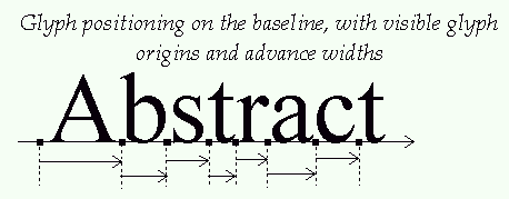
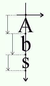
    The baseline is an imaginary line that is used to "guide" glyphs when rendering text. It can be horizontal (e.g. Roman, Cyrillic, Arabic, etc.) or vertical (e.g. Chinese, Japanese, Korean, etc). Moreover, to render text, a virtual point, located on the baseline, called the "pen position" or "origin", is used to locate glyphs.

    Each layout uses a different convention for glyph placement:
     

  • with horizontal layout, glyphs simply "rest" on the baseline. Text is rendered by incrementing the pen position, either to the right or to the left.

  •  IV. Kerning

    The term 'kerning' refers to specific information used to adjust the relative positions of coincident glyphs in a string of text. This section describes several types of kerning information, as well as the way to process them when performing text layout.
     

    1. Kerning pairs

    Kerning consists in modifying the spacing between two successive glyphs according to their outlines. For example, a "T" and a "y" can be easily moved closer, as the top of the "y" fits nicely under the "T"'s upper right bar.

    When laying out text with only their standard widths, some consecutive glyphs sometimes seem a bit too close or too distant. For example, the space between the 'A' and the 'V' in the following word seems a little wider than needed.

    Compare this to the same word, when the distance between these two letters has been slightly reduced :

    As you can see, this adjustment can make a great difference. Some font faces thus include a table containing kerning distances for a set of given glyph pairs, used during text layout. Note that :
     

    • The pairs are ordered, i.e. the space for pair (A,V) isn't necessarily the space for pair (V,A). They also index glyphs, and not characters.
    • Kerning distances can be expressed in horizontal or vertical directions, depending on layout and/or script. For example, some horizontal layouts like arabic can make use of vertical kerning adjustments between successive glyphs. A vertical script can have vertical kerning distances.
    • Kerning distances are expressed in grid units. They are usually oriented in the X axis, which means that a negative value indicates that two glyphs must be set closer in a horizontal layout.

    2. Applying kerning

    Applying kerning when rendering text is a rather easy process. It merely consists in adding the scaled kern distance to the pen position before writing each next glyph. However, the typographically correct renderer must take a few more details in consideration.

    The "sliding dot" problem is a good example : many font faces include a kerning distance between capital letters like "T" or "F" and a following dot ("."), in order to slide the latter glyph just right to their main leg. I.e.

    However, this sometimes requires additional adjustments between the dot and the letter following it, depending on the shapes of the enclosing letters. When applying "standard" kerning adjustments, the previous sentence would become :

    Which clearly is too contracted. The solution here, as exhibited in the first example is to only slide the dots when possible. Of course, this requires a certain knowledge of the text's meaning. The above adjustments would not necessarily be welcomed if we were rendering the final dot of a given paragraph.

    This is only one example, and there are many others showing that a real typographer is needed to layout text properly. If not available, some kind of user interaction or tagging of the text could be used to specify some adjustments, but in all cases, this requires some support in applications and text libraries.

    For more mundane and common uses, however, we can have a very simple algorithm, which  avoids the sliding dot problem, and others, though not producing optimal results. It can be seen as :
     

    1. place the first glyph on the baseline
    2. save the location of the pen position/origin in pen1
    3. adjust the pen position with the kerning distance between the first and second glyph
    4. place the second glyph and compute the next pen position/origin in pen2.
    5. use pen1 as the next pen position if it is beyond pen2, use pen2 otherwise.


    V. Text processing

    This section demonstrates how to use the concepts previously defined to render text, whatever the layout you use.
     

    1. Writing simple text strings :

    In this first example, we'll generate a simple string of Roman text, i.e. with a horizontal left-to-right layout. Using exclusively pixel metrics, the process looks like :
    1) convert the character string into a series of glyph indexes.
    2) place the pen to the cursor position.
    3) get or load the glyph image.
    4) translate the glyph so that its 'origin' matches the pen position
    5) render the glyph to the target device
    6) increment the pen position by the glyph's advance width in pixels
    7) start over at step 3 for each of the remaining glyphs
    8) when all glyphs are done, set the text cursor to the new pen position
    Note that kerning isn't part of this algorithm.

    2. Sub-pixel positioning :

    It is somewhat useful to use sub-pixel positioning when rendering text. This is crucial, for example, to provide semi-WYSIWYG text layouts. Text rendering is very similar to the algorithm described in sub-section 1, with the following few differences :


    Which finally looks like :

    1. convert the character string into a series of glyph indexes.
    2. place the pen to the cursor position. This can be a non-integer point.
    3. get or load the glyph image.
    4. translate the glyph so that its 'origin' matches the rounded pen position.
    5. render the glyph to the target device
    6. increment the pen position by the glyph's advance width in fractional pixels.
    7. start over at step 3 for each of the remaining glyphs
    8. when all glyphs are done, set the text cursor to the new pen position
    Note that with fractional pixel positioning, the space between two given letters isn't fixed, but determined by the accumulation of previous rounding errors in glyph positioning.

    3.  Simple kerning :

    Adding kerning to the basic text rendering algorithm is easy : when a kerning pair is found, simply add the scaled kerning distance to the pen position before step 4. Of course, the distance should be rounded in the case of algorithm 1, though it doesn't need to for algorithm 2. This gives us :

    Algorithm 1 with kerning:

    3) get or load the glyph image.
    4) Add the rounded scaled kerning distance, if any, to the pen position
    5) translate the glyph so that its 'origin' matches the pen position
    6) render the glyph to the target device
    7) increment the pen position by the glyph's advance width in pixels
    8) start over at step 3 for each of the remaining glyphs


    Algorithm 2 with kerning:

    3) get or load the glyph image.
    4) Add the scaled unrounded kerning distance, if any, to the pen position.
    5) translate the glyph so that its 'origin' matches the rounded pen position.
    6) render the glyph to the target device
    7) increment the pen position by the glyph's advance width in fractional pixels.
    8) start over at step 3 for each of the remaining glyphs
    Of course, the algorithm described in section IV can also be applied to prevent the sliding dot problem if one wants to..

    4. Right-To-Left Layout :

    The process of laying out arabic or hebrew text is extremely similar. The only difference is that the pen position must be decremented before the glyph rendering (remember : the advance width is always positive, even for arabic glyphs). Thus, algorithm 1 becomes :

    Right-to-left Algorithm 1:

    3) get or load the glyph image.
    4) Decrement the pen position by the glyph's advance width in pixels
    5) translate the glyph so that its 'origin' matches the pen position
    6) render the glyph to the target device
    7) start over at step 3 for each of the remaining glyphs


    The changes to Algorithm 2, as well as the inclusion of kerning are left as an exercise to the reader.


    5. Vertical layouts :

    Laying out vertical text uses exactly the same processes, with the following significant differences :
     
  • The baseline is vertical, and the vertical metrics must be used instead of the horizontal one.
  • The left bearing is usually negative, but this doesn't change the fact that the glyph origin must be located on the baseline.
  • The advance height is always positive, so the pen position must be decremented if one wants to write top to bottom (assuming the Y axis is oriented upwards).
  • Through the following algorithm :
    1) convert the character string into a series of glyph indexes.
    2) place the pen to the cursor position.
    3) get or load the glyph image.
    4) translate the glyph so that its 'origin' matches the pen position
    5) render the glyph to the target device
    6) decrement the vertical pen position by the glyph's advance height in pixels
    7) start over at step 3 for each of the remaining glyphs
    8) when all glyphs are done, set the text cursor to the new pen position

    6. WYSIWYG text layouts :

    As you probably know, the acronym WYSIWYG stands for 'What You See Is What You Get'. Basically, this means that the output of a document on the screen should match "perfectly" its printed version. A true wysiwyg system requires two things :

    device-independent text layout

    Which means that the document's formatting is the same on the screen than on any printed output, including line breaks, justification, ligatures, fonts, position of inline images, etc..


    matching display and print character sizes

    Which means that the displayed size of a given character should match its dimensions when printed. For example, a text string which is exactly 1 inch tall when printed should also appear 1 inch tall on the screen (when using a scale of 100%).


    It is clear that matching sizes cannot be possible if the computer has no knowledge of the physical resolutions of the display device(s) it is using. And of course, this is the most common case ! That's not too unfortunate, however  because most users really don't care about this feature. Legibility is much more important.

    When the Mac appeared, Apple decided to choose a resolution of 72 dpi to describe the Macintosh screen to the font sub-system (whatever the monitor used). This choice was most probably driven by the fact that, at this resolution, 1 point = 1 pixel. However; it neglected one crucial fact : as most users tend to choose a document character size between 10 and 14 points, the resultant displayed text was rather small and not too legible without scaling. Microsoft engineers took notice of this problem and chose a resolution of 96 dpi on Windows, which resulted in slightly larger, and more legible, displayed characters (for the same printed text size).

    These distinct resolutions explain some differences when displaying text at the same character size on a Mac and a Windows machine. Moreover, it is not unusual to find some TrueType fonts with enhanced hinting (tech note: through delta-hinting) for the sizes of 10, 12, 14 and 16 points at 96 dpi.
     

    As for device-independent text, it is a notion that is, unfortunately, often abused. For example, many word processors, including MS Word, do not really use device-independent glyph positioning algorithms when laying out text. Rather, they use the target printer's resolution to compute hinted glyph metrics for the layout. Though it guarantees that the printed version is always the "nicest" it can be, especially for very low resolution printers (like dot-matrix), it has a very sad effect : changing the printer can have dramatic effects on the whole document layout, especially if it makes strong use of justification, uses few page breaks, etc..

    Because the glyph metrics vary slightly when the resolution changes (due to hinting), line breaks can change enormously, when these differences accumulate over long runs of text. Try for example printing a very long document (with no page breaks) on a 300 dpi ink-jet printer, then the same one on a 3000 dpi laser printer : you'll be extremely lucky if your final page count didn't change between the prints ! Of course, we can still call this WYSIWYG, as long as the printer resolution is fixed !!

    Some applications, like Adobe Acrobat, which targeted device-independent placement from the start, do not suffer from this problem. There are two ways to achieve this : either use the scaled and unhinted glyph metrics when laying out text both in the rendering and printing processes, or simply use wathever metrics you want and store them with the text in order to get sure they're printed the same on all devices (the latter being probably the best solution, as it also enables font substitution without breaking text layouts).

    Just like matching sizes, device-independent placement isn't necessarily a feature that most users want. However, it is pretty clear that for any kind of professional document processing work, it is a requirement.


    VI. FreeType outlines :

    The purpose of this section is to present the way FreeType manages vectorial outlines, as well as the most common operations that can be applied on them.
     

    1. FreeType outline description and structure :

    a. Outline curve decomposition :

    An outline is described as a series of closed contours in the 2D plane. Each contour is made of a series of line segments and bezier arcs. Depending on the file format, these can be second-order or third-order polynomials. The former are also called quadratic or conic arcs, and they come from the TrueType format. The latter are called cubic arcs and mostly come from the Type1 format.

    Each arc is described through a series of start, end and control points. Each point of the outline has a specific tag which indicates wether it is used to describe a line segment or an arc. The tags can take the following values :


    FT_Curve_Tag_On 
    Used when the point is "on" the curve. This corresponds to start and end points of segments and arcs. The other tags specify what is called an "off" point, i.e. one which isn't located on the contour itself, but serves as a control point for a bezier arc.
    FT_Curve_Tag_Conic
    Used for an "off" point used to control a conic bezier arc.
    FT_Curve_Tag_Cubic
    Used for an "off" point used to control a cubic bezier arc.
     

    The following rules are applied to decompose the contour's points into segments and arcs :

  • two successive "on" points indicate a line segment joining them.
  • b. Outline descriptor :

    A FreeType outline is described through a simple structure, called FT_Outline, which fields are :
     
     
    n_points the number of points in the outline
    n_contours the number of contours in the outline
    points array of point coordinates
    contours array of contour end indices
    flags array of point flags

    Here, points is a pointer to an array of FT_Vector records, used to store the vectorial coordinates of each outline point. These are expressed in 1/64th of a pixel, which is also known as the 26.6 fixed float format.

    contours is an array of point indices used to delimit contours in the outline. For example, the first contour always starts at point 0, and ends a point contours[0]. The second contour starts at point "contours[0]+1" and ends at contours[1], etc..

    Note that each contour is closed, and that n_points should be equal to "contours[n_contours-1]+1" for a valid outline.

    Finally, flags is an array of bytes, used to store each outline point's tag.


    2. Bounding and control box computations :

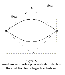
    A bounding box (also called "bbox") is simply the smallest possible rectangle that encloses the shape of a given outline. Because of the way arcs are defined, bezier control points are not necessarily contained within an outline's bounding box.

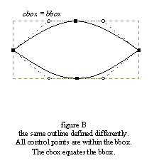
    This situation happens when one bezier arc is, for example, the upper edge of an outline and an off point happens to be above the bbox. However, it is very rare in the case of character outlines because most font designers and creation tools always place on points at the extrema of each curved edges, as it makes hinting much easier.

    We thus define the control box (a.k.a. the "cbox") as the smallest possible rectangle that encloses all points of a given outline (including its off points). Clearly, it always includes the bbox, and equates it in most cases.

    Unlike the bbox, the cbox is also much faster to compute.
     

    Control and bounding boxes can be computed automatically through the functions FT_Get_Outline_CBox and FT_Get_Outline_BBox. The former function is always very fast, while the latter may be slow in the case of "outside" control points (as it needs to find the extreme of conic and cubic arcs for "perfect" computations). If this isn't the case, it's as fast as computing the control box.

    Note also that even though most glyph outlines have equal cbox and bbox to ease hinting, this is not necessary the case anymore when a
    transform like rotation is applied to them.
     

     3. Coordinates, scaling and grid-fitting :

    An outline point's vectorial coordinates are expressed in the 26.6 format, i.e. in 1/64th of a pixel, hence coordinates (1.0, -2.5) is stored as the integer pair ( x:64, y: -192 ).

    After a master glyph outline is scaled from the EM grid to the current character dimensions, the hinter or grid-fitter is in charge of aligning important outline points (mainly edge delimiters) to the pixel grid. Even though this process is much too complex to be described in a few lines, its purpose is mainly to round point positions, while trying to preserve important properties like widths, stems, etc..

    The following operations can be used to round vectorial distances in the 26.6 format to the grid :

    round(x)   ==  (x+32) & -64
    floor(x)   ==       x & -64
    ceiling(x) ==  (x+63) & -64

    Once a glyph outline is grid-fitted or transformed, it often is interesting to compute the glyph image's pixel dimensions before rendering it. To do so, one has to consider the following :

    The scan-line converter draws all the pixels whose centers fall inside the glyph shape. It can also detect "drop-outs", i.e. discontinuities coming from extremely thin shape fragments, in order to draw the "missing" pixels. These new pixels are always located at a distance less than half of a pixel but one cannot predict easily where they'll appear before rendering.

    This leads to the following computations :


    By grid-fitting the bounding box, one guarantees that all the pixel centers that are to be drawn, including those coming from drop-out control, will be within the adjusted box. Then the box's dimensions in pixels can be computed.

    Note also that, when translating a grid-fitted outline, one should always use integer distances to move an outline in the 2D plane. Otherwise, glyph edges won't be aligned on the pixel grid anymore, and the hinter's work will be lost, producing very low quality bitmaps and pixmaps..


    VII. FreeType bitmaps :

    The purpose of this section is to present the way FreeType manages bitmaps and pixmaps, and how they relate to the concepts previously defined. The relationships between vectorial and pixel coordinates is explained.
     

    1. FreeType bitmap and pixmap descriptor :

    A bitmap or pixmap is described through a single structure, called FT_Raster_Map. It is a simple descriptor whose fields are :
     
     
    FT_Raster_Map
    rows the number of rows, i.e. lines, in the bitmap
    width the number of horizontal pixels in the bitmap
    cols the number of "columns", i.e. bytes per line, in the bitmap
    flow the bitmap's flow, i.e. orientation of rows (see below)
    pix_bits the number of bits per pixels. valid values are 1, 4, 8 and 16
    buffer a typeless pointer to the bitmap pixel bufer

    The bitmap's flow determines wether the rows in the pixel buffer are stored in ascending or descending order. Possible values are FT_Flow_Up (value 1) and FT_Flow_Down (value -1).

    Remember that FreeType uses the Y upwards convention in the 2D plane. Which means that a coordinate of (0,0) always refer to the lower-left corner of a bitmap.

    In the case of an 'up' flow, the rows are stored in increasing vertical position, which means that the first bytes of the pixel buffer are part of the lower bitmap row. On the opposite, a 'down' flow means that the first buffer bytes are part of the upper bitmap row, i.e. the last one in ascending order.

    As a hint, consider that when rendering an outline into a Windows or X11 bitmap buffer, one should always use a down flow in the bitmap descriptor.
     

    2. Vectorial versus pixel coordinates :

    This sub-section explains the differences between vectorial and pixel coordinates. To make things clear, brackets will be used to describe pixel coordinates, e.g. [3,5], while parentheses will be used for vectorial ones, e.g. (-2,3.5).

    In the pixel case, as we use the Y upwards convention, the coordinate [0,0] always refers to the lower left pixel of a bitmap, while coordinate [width-1, rows-1] to its upper right pixel.

    In the vectorial case, point coordinates are expressed in floating units, like (1.25, -2.3). Such a position doesn't refer to a given pixel, but simply to an immaterial point in the 2D plane

    The pixels themselves are indeed square boxes of the 2D plane, which centers lie in half pixel coordinates. For example, the lower left pixel of a bitmap is delimited by the square (0,0)-(1,1), its center being at location (0.5,0.5).

    This introduces some differences when computing distances. For example, the "length" in pixels of the line [0,0]-[10,0] is 11. However, the vectorial distance between (0,0)-(10,0) covers exactly 10 pixel centers, hence its length if 10.

    3. Converting outlines into bitmaps and pixmaps :

    Generating a bitmap or pixmap image from a vectorial image is easy with FreeType. However, one must understand a few points regarding the positioning of the outline in the 2D plane before calling the function FT_Get_Outline_Bitmap. These are :


    A common mistake made by many developers when they begin using FreeType is believing that a loaded outline can be directly rendered in a bitmap of adequate dimensions. The following images illustrate why this is a problem :


    Indeed, in nearly all cases, the loaded or transformed outline must be translated before it is rendered into a target bitmap, in order to adjust its position relative to the target window.

    For example, the correct way of creating a standalone glyph bitmap is thus to :


    In the case where one wants to write glyph images directly into a large bitmap, the outlines must be translated so that their vectorial position correspond to the current text cursor/character origin.


    VII. FreeType anti-aliasing :

    IMPORTANT NOTE :
    This section is still in progress, as the way FreeType 2 handles anti-aliased rendering hasn't been definitely set yet. The main reason being that a flexible way of doing things is needed in order to allow further improvements in the raster (i.e. number of gray levels > 100, etc..).

    1. What is anti-aliasing :

    Anti-aliasing works by using various levels of grays to reduce the "staircase" artefacts visible on the diagonals and curves of glyph bitmaps. It is a way to artificially enhance the display resolution of the target device. It can smooth out considerably displayed or printed text.

    2. How does it work with FreeType :

    FreeType's scan-line converter is able to produce anti-aliased output directly. It is however limited to 8-bit pixmaps and 5 levels of grays (or 17 levels, depending on a build configuration option). Here's how one should use it :

    a. Set the gray-level palette :

    The scan-line converter uses 5 levels for anti-aliased output. Level 0 corresponds to the text background color (e.g. white), and level 5 to the text foreground color. Intermediate levels are used for intermediate shades of grays.

    You must set the raster's palette when you want to use different colors, use the function FT_Raster_Set_Palette as in :

    {
      static const char  gray_palette[5] = { 0, 7, 15, 31, 63 };
      …
      error = FT_Set_Raster_Palette( library, 5, palette );
    }
     

    • The first parameter is a handle to a FreeType library object. See the user guide for more details (the library contains a scan-line converter object).
    • The second parameter is the number of entries in the gray-level palette. Valid values are 5 and 17 for now, but this may change in later implementations.
    • The last parameter is a pointer to a char table containing the pixel value for each of the gray-levels. In this example, we use a background color of 0, a foreground color of 63, and intermediate values in-between.


    The palette is copied in the raster object, as well as processed to build several lookup-tables necessary for the internal anti-aliasing algorithm.
     

    b. Render the pixmap :

    The scan-line converter doesn't create bitmaps or pixmaps, it simply renders into those that are passed as parameters to the function FT_Get_Outline_Bitmap. To render an anti-aliased pixmap, simply set the target bitmap’s depth to 8. Note however that this target 8-bit pixmap must always have a 'cols' field padded to 32-bits, which means that the number of bytes per lines of the pixmap must be a multiple of 4 !

    Once the palette has been set, and the pixmap buffer has been created to receive the glyph image, simply call FT_Get_Outline_Bitmap. Take care of clearing the target pixmap with the background color before calling this function. For the sake of simplicity and efficiency, the raster is not able to compose anti-aliased glyph images on a pre-existing images.

    Here's some code demonstrating how to load and render a single glyph pixmap :

    {
      FT_Outline     outline;
      FT_Raster_Map  pixmap;
      FT_BBox        cbox;
      …

      // load the outline
      …

      // compute glyph dimensions (grid-fit cbox, etc..)
      FT_Get_Outline_CBox( &outline, &cbox );

      cbox.xMin = cbox.xMin & -64;       // floor(xMin)
      cbox.yMin = cbox.yMin & -64;       // floor(yMin)
      cbox.xMax = (cbox.xMax+32) & -64;  // ceiling(xMax)
      cbox.yMax = (cbox.yMax+32) & -64;  // ceiling(yMax)

      pixmap.width = (cbox.xMax - cbox.xMin)/64;
      pixmap.rows  = (cbox.yMax - cbox.yMin)/64;

      // fill the pixmap descriptor and create the pixmap buffer
      // don't forget to pad the 'cols' field to 32 bits
      pixmap.pix_bits = 8;
      pixmap.flow     = FT_Flow_Down;
      pixmap.cols     = (pixmap.width+3) & -4;  // pad 'cols' to 32 bits
      pixmap.buffer   = malloc( pixmap.cols * pixmap.rows );

      // fill the pixmap buffer with the background color
      //
      memset( pixmap.buffer, 0, pixmap.cols*pixmap.rows );

      // translate the outline to match (0,0) with the glyph's
      // lower left corner (ignore the bearings)
      // the cbox is grid-fitted, we won't ruin the hinting.
      //
      FT_Translate_Outline( &outline, -cbox.xMin, -cbox.yMin );

      // render the anti-aliased glyph pixmap
      error = FT_Get_Outline_Bitmap( library, &outline, &pixmap );

      // save the bearings for later use..
      corner_x = cbox.xMin / 64;
      corner_y = cbox.yMin / 64;
    }

    The resulting pixmap is always anti-aliased.

    3. Possible enhancements :

    FreeType's raster (i.e. its scan-line converter) is currently limited to producing either 1-bit bitmaps or anti-aliased 8-bit pixmaps. It is not possible, for example, to draw directly a bitmapped glyph image into a 4, 8 or 16-bit pixmap through a call to FT_Get_Outline_Bitmap.

    Moreover, the anti-aliasing filter is limited to use 5 or 17 levels of grays (through 2x2 and 4x4 sub-sampling). There are cases where this could seem insufficient for optimal results and where a higher number of levels like 64 or 128 would be a good thing.

    These enhancements are all possible but not planned for an immediate future of the FreeType engine.