1. Baseline, pens and layouts
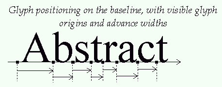
The baseline is an imaginary line that is used to "guide" glyphs when
rendering text. It can be horizontal (e.g. Roman, Cyrillic, Arabic,
etc.) or vertical (e.g. Chinese, Japanese, Korean, etc). Moreover, to
render text, a virtual point, located on the baseline, called the pen
position or origin, is used to locate glyphs.
Each layout uses a different convention for glyph placement:
-
With horizontal layout, glyphs simply "rest" on the baseline.
Text is rendered by incrementing the pen position, either to the
right or to the left.
The distance between two successive pen positions is
glyph-specific and is called the advance width. Note that
its value is always positive, even for right-to-left
oriented alphabets, like Arabic. This introduces some differences
in the way text is rendered.
The pen position is always placed on the baseline.

-
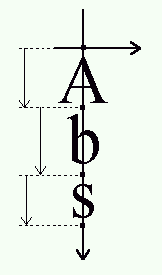
With a vertical layout, glyphs are centered around the
baseline:

4. The effects of grid-fitting
Because hinting aligns the glyph's control points to the pixel grid,
this process slightly modifies the dimensions of character images in
ways that differ from simple scaling.
For example, the image of the lowercase "m" letter sometimes fits a
square in the master grid. However, to make it readable at small pixel
sizes, hinting tends to enlarge its scaled outline in order to keep its
three legs distinctly visible, resulting in a larger character
bitmap.
The glyph metrics are also influenced by the grid-fitting process:
-
The image's width and height are altered. Even if this is only by
one pixel, it can make a big difference at small pixel sizes.
-
The image's bounding box is modified, thus modifying the bearings.
-
The advances must be updated. For example, the advance width must
be incremented if the hinted bitmap is larger than the scaled one,
to reflect the augmented glyph width.
This has some implications:
-
Because of hinting, simply scaling the font ascent or descent might
not give correct results. A possible solution is to keepthe ceiling
of the scaled ascent, and floor of the scaled descent.
-
There is no easy way to get the hinted glyph and advance widths of a
range of glyphs, as hinting works differently on each outline. The
only solution is to hint each glyph separately and record the
returned values. Some formats, like TrueType, even include a table
of pre-computed values for a small set of common character pixel
sizes.
-
Hinting depends on the final character width and height in pixels,
which means that it is highly resolution-dependent. This property
makes correct WYSIWYG layouts difficult to implement.
Performing 2D transformations on glyph outlines is very easy with
FreeType. However, when using translation on a hinted outlines, one
should aways take care of exclusively using integer pixel
distances (which means that the parameters to the
FT_Translate_Outline() API should all be multiples
of 64, as the point coordinates are in 26.6 fixed float
format).
Otherwise, the translation will simply ruin the hinter's
work, resulting in a very low quality bitmaps!
5. Text widths and bounding box
As seen before, the "origin" of a given glyph corresponds to the
position of the pen on the baseline. It is not necessarily located on
one of the glyph's bounding box corners, unlike many typical bitmapped
font formats. In some cases, the origin can be out of the bounding box,
in others, it can be within it, depending on the shape of the given
glyph.
Likewise, the glyph's "advance width" is the increment to apply to
the pen position during layout, and is not related to the glyph's
"width", which really is the glyph's bounding width.
The same conventions apply to strings of text. This means that:
-
The bounding box of a given string of text doesn't necessarily
contain the text cursor, nor is the latter located on one of its
corners.
-
The string's advance width isn't related to its bounding box
dimensions. Especially if it contains beginning and terminal spaces
or tabs.
-
Finally, additional processing like kerning creates strings of text
whose dimensions are not directly related to the simple
juxtaposition of individual glyph metrics. For example, the advance
width of "VA" isn't the sum of the advances of "V" and "A" taken
separately.